Shopping Bag (0)
Shopping bag is empty


Alex Wilson, ECD at brand experience agency Amplify, examines what 3D billboards offer brands...
The humble billboard is evolving as creative uses of 3D imagery are being used to sell everything from movies to video games to sneakers. Here, Alex Wilson, ECD at brand experience agency Amplify, examines what they offer for brands
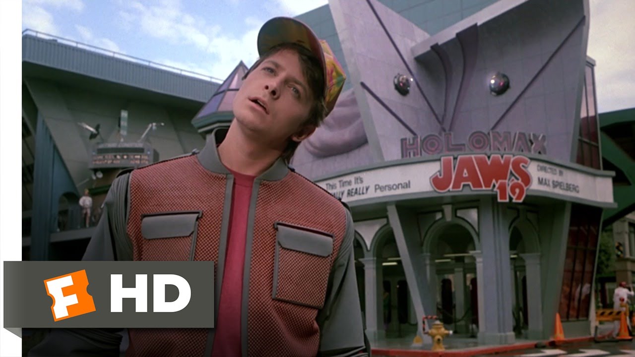
There is a well-known scene in Back to the Future II, when the 1989 film predicts that by 2015 there will be giant 3D holographic advertisements protruding from buildings.
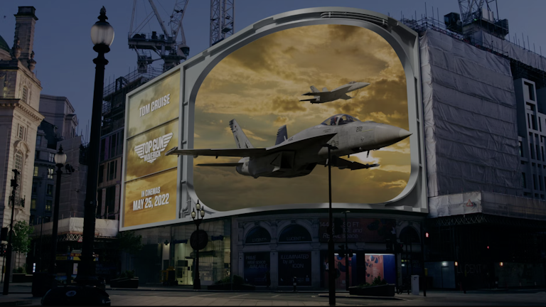
Here in 2022 that cinematic vision of the future is our very real present, with A-list stars – most recently Tom Cruise in Top Gun: Maverick – and enormous sneakers extending towards us through anamorphic billboards.
Today’s billboards may not be quite as immersive as Marty McFly being swallowed whole by a 50ft holographic great white from Jaws 19, but it wasn’t a bad foretelling by the filmmakers. (I am, however, still eagerly awaiting the hoverboards.)
The last couple of years have seen a surge in the use of anamorphic billboards. From product to IP and beyond, the format can be used to tell stories and subvert expectations. But what is the true potential of them, and how can creatives fully unleash it?
The core go-to route for many brands is to put product front and centre, often using it as the focus point of the illusion, attempting to get that pair of sneakers or can of beer as close to the audience as possible. But there are so many creative avenues that this canvas can be utilised for.
Fortnite subverted expectations for how anamorphic should behave with its Chapter 3 launch, going against the trend of illusions breaking out from the screen and instead we created 3D environments packed with breadcrumbs and clues to tease the new chapter, fuel the hype machine on Twitch and drive online fan engagement.
Treating OOH less as an advertising space and more as an entertainment hub or focused audience engagement tool can power the content engine to generate content that really travels.
And when we talk about content that travels, in reality, the primary way these 3D billboards are experienced are not necessarily through the eyes of the IRL audience at ground level, but through the screen of UGC or accompanying curated content output. This opens up the world building and storytelling opportunities beyond whatever 60 second narrative is being told on the side of a building, allowing post production and context to be added.
And what that does is present larger storytelling opportunities across multiple sites. The nostalgic and iconic power of Top Gun: Maverick meant our team could have just flown anamorphic F18 jets around the world and the audience would have connected the dots. However, the cinematic nature of the IP meant we wanted to push the creative and the technology to mirror key story beats and moments audiences had responded well to in the pre-released movie trailers. The potential for creating global campaigns where the full story is primarily told through inter-connected content is just scratching the surface.
The next stage of anamorphic creativity lies in experimentation. Not only with the 3D technology and how we make different aspects of the illusion create an impact, but also how we bring alternative ways of telling the story to life. These stories don’t have to be bound by a singular billboard or OOH site, we should instead be treating anamorphic as a canvas which can connect a multitude of campaign components and locations together.
This is exactly the approach taken for Louis Vuitton x NIKE. A dreamlike piece that celebrates Virgil Abloh’s creative vision, the artisanal craft of the product and the accompanying digital artistry, living as a 60 second companion piece to the NYC exhibition. This brought the product to the fore through brand worldbuilding and cohesive narrative that ran through the larger campaign.
It’s not just about making something shiny come out of the billboard, it’s about how you pull the audience in, build the world around them and tell a much bigger story.
In an age of skippable content, anamorphic is unmissable.
To read the full article visit Creative Review.
