Shopping Bag (0)
Your shopping bag is empty


How Amplify transformed retail experience design for Google Pixel 3’s Curiosity Rooms
Open through November and December of last year, the Curiosity Rooms was a landmark destination created by brand experience agency, Amplify, to mark the launch of the new Google Pixel 3 phone. At the core of the brief, the challenge was to ‘make every day more extraordinary’, and Amplify did just that – building the Curiosity Rooms concept, and taking over three floors of an unused store in London’s Regent Street. The initiative included talks, workshops, catwalk shows, dining experiences and performances, with appearances from the likes of Professor Green and John Boyega.
Project Background
With a long-established background in brand experience, Amplify has worked with Google for the last few years on a variety of campaigns and experiential launches. In 2018, we saw our biggest collaboration yet, when we were set the brief to lead experience design for the launch of Google Pixel 3. Alongside the design and production of the brand’s press launch in October, and the Pixel 3 influencer on-boarding programme that followed, we were also set the task of designing and building the flagship consumer launch activation – Curiosity Rooms.
In August, we were set the brief to launch Pixel 3 on a whole new scale, by creating a landmark destination that brought the campaign theme of ‘making every day more extraordinary’ to life. We knew very quickly that our venue selection was going to be key, not only in creating the buzzworthy chatter that would give the campaign reach beyond London, but also in creating the beacon that would draw consumers over the five-week run.
Thankfully, we landed on the location of a lifetime. The old Tower Records building at 55 Regent Street, right in the heart of London’s busiest retail district, and on the corner of the iconic Piccadilly Circus. A space offering us a completely blank canvas to do something ‘extraordinary’.Establishing Experience Principles
Irrespective of the task at hand, our first port of call as an agency and studio is to interrogate each brief and establish a series of experience principles. These not only guide design to architecture, but also ensure that every experience and piece of content we create has a purpose. Once our insights and strategy team had unlocked our audience’s passion points, our guiding principles laid the groundwork for experiences that gave a curious audience something more than just another ‘Instagrammable’ backdrop.Core to these principles was ensuring that we tapped into our location, and the everyday culture of London. Yes, we had a bold destination in the heart of London, but would it represent the best of the city? What were the ‘everyday’ experiences and collaborations that could be housed inside that would ensure it lived far beyond its location? Once those were established, we had a benchmark to critique and stress test every Curiosity Rooms experience and bring the right partners on board – from coffee shops and chefs, to designers, local retailers and cultural tastemakers.
Transforming the space: Architecture and Material Design
When we first saw 55 Regent Street, it was a building site. A fully-decommissioned retail store, with no floors, no infrastructure, no services. With an eight-week turnaround for design and just two weeks for build, a big part of the process was not only figuring out the best use of space across the three floors, but also how we could reimagine what a retail brand experience should be. The architectural lead in our studio very quickly began to draw up plans for the different levels, based on a simple direction for each space.
The ground floor was given over to making a hero of the Pixel 3. This is where people could get hands-on with the device, and where we developed the majority of the feature-led ‘extraordinary’ experiences. On the first floor, we extended these experiences into a ‘Maker’s Studio’ for workshops and Pixel 3 personalisation. This level also provided space for our local neighbourhood coffee shop, a mini amphitheatre for 150 guests to take in an intimate talk, and our mini retail street of partner pop-up stores. The 15,000 square foot basement was then used for our content programme. From podcasts to talks, catwalk shows to dining experiences, the lowest level gave us our most versatile canvas and the ability to adapt the landscape and staging night after night, show after show.
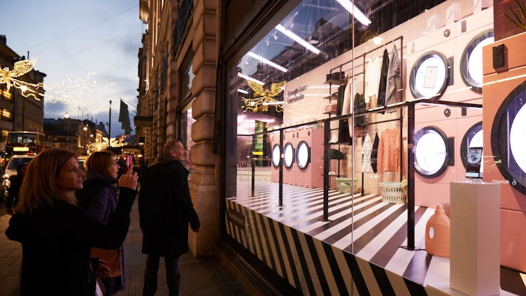
Alongside the main space, we also had the exciting challenge of designing 11 showcase window displays on Regent Street and Piccadilly. Core to the approach for these spaces was a desire to remove the barrier between what was happening inside, and what was happening on the street. Designing spaces and window displays that could bring people in visually, and physically make them a hero of the experience.
Once the spatial and window layout was set out, the team then had to select and apply the material design for each and every surface. What materials would fit in with the wider Google Pixel 3 campaign palette? What materials could be used that were sustainably made and sourced? What materials could also stand up to the heavy wear and tear of Regent Street footfall over five weeks? Not to mention figuring out the material challenge of transforming an everyday escalator into an extraordinary slide for guests to travel through the space.
The Visual Layer: 2D design
With 72andSunny providing a design playbook for all Pixel 3 comms, it was imperative for our design team to ensure the graphic language for Curiosity Rooms worked harmoniously with the wider Google campaign.
An important part of this process included creating a clean palette that seamlessly balanced colours. Creating strong visual cues for the wider campaign not only made the experience instantly recognisable as a Google event, but also enabled us to make a bold stamp on the Piccadilly location at one of the busiest times of the year.
At this stage of the process, we also developed the wider typographical and 2D design. In this phase, the team created elements that established cohesion between the three floors, alongside signposting that would guide guests through the space and stoke their curiosity.
Seeing is Believing: 3D Visualisation
With the project running at a rate of knots to hit the live date in November, producing iterative 3D visuals of the spatial design became critical for stress-testing material and 2D design, and for securing client sign-off.
This part of the process is increasingly important in all of our experiential projects, and provides a clear view of each space before it becomes reality. For the Curiosity Rooms, it also ensured every key stakeholder had sight of a unified vision across the project’s progression. Spaces and designs could be shared for sign off in real time, maintaining the pace of production in the studio, and our build partner’s workshops.
The real excitement then comes in seeing the physical site transform and leap off the screen, as the final space lives up to the polish and mapping of the 3D visuals.
Making it a Reality: Production
No project can truly come to life without the expertise and drive of the production team. On hand throughout the design and development phase, the team truly comes into its own on the ground. Not only is this seen in the logistical organisation of the build and tech that makes the site function as a space, but also the planning and day-to-day running of the entire show.
The production team served as the beating heart of the live experience. From the scripts and training that ensured brand ambassadors could bring the features of the Pixel 3 to life, to delivering the programme of talks and events alongside an evolving live space, they ensured the ideas on the page lived up to reality, and surpassed the expectations of the brand.
Making it Last
Creating a brand experience that lasts a five week run is one thing, but what’s the legacy? Across the entire duration of the project, creating the right media partnerships was key in attracting the target audience to the venue, and maintaining engagement throughout the experience. Partners including Conde Nast, Hypebeast, Time Out and The Guardianwere vital for ensuring the location became a destination outside of the naturally high footfall of Piccadilly alone.
Also key was choosing the right collaborators. The experience was only ever going to be as good as those who created moments within it – moments that would endure beyond the five weeks. Podcasts created and recorded by the likes of Fearne Cotton, Professor Green and Jessie Ware ensured people could revisit and discover some of the event’s biggest highlights.
Supper clubs with restaurants that served up great bites from the city also produced a unique food guide that people can continue to explore around London long after the event has finished. And capsule clothing collections created onsite from the likes of Liam Hodges and i-D magazine continue to be worn in an extraordinary way day-to-day.
Whilst only ever a short-lived landmark destination, Curiosity Rooms surpassed expectations, creating a wealth of shareable content that reached far beyond London and connected with those who couldn’t visit in person on a national and global scale.